Analytics
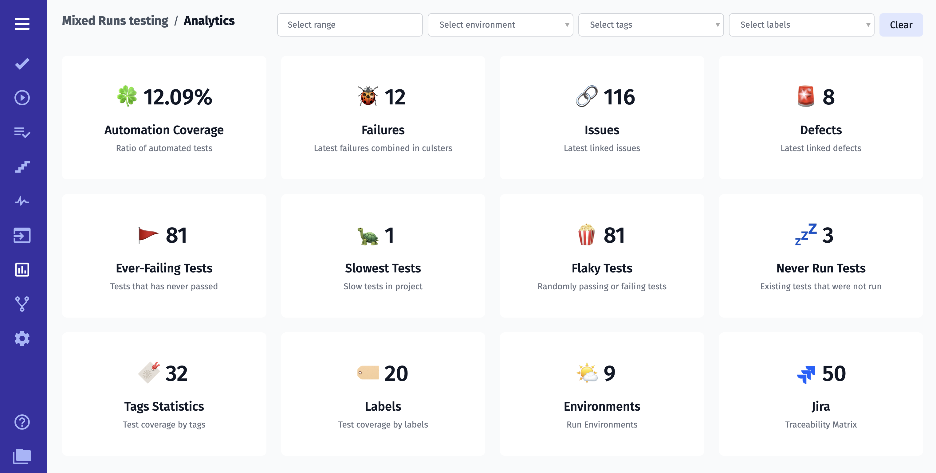
As a test management system, Testomat.io Team intends to provide our users with as much valuable testing data as possible. For this purpose, we developed Analytics Feature.
How Does It Work?
Testomat.io tracks your automated and manual tests, aggregates their statuses history, analyzes them, defines tests by Analytics categories, and shows them to you. You can configure these metrics. So you can give a more precise glance to prevent bugs. This also means that Analytics widgets are updated and supplemented with each completed Test Run.
Let’s have more close look at it!
Analytics range
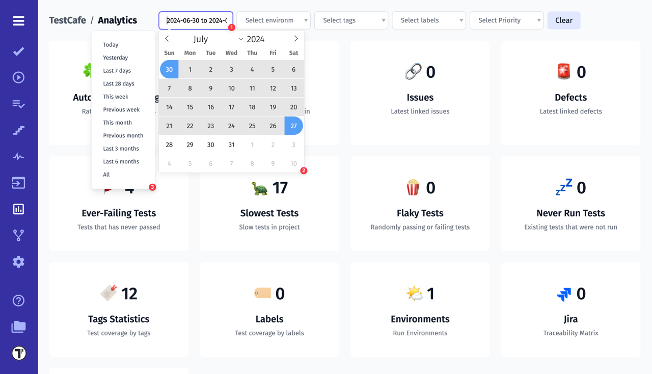
Analytics data loads for the last 4 weeks by default. But you have the option to change the date range to suit your specific needs.
- You have the option to specify the range manually by entering a value in the field using a template:
2024-06-30 to 2024-07-27. - Or select the desired date range from the drop-down calendar. The calendar is very flexible and will provide you with accurate analytics for the specified range.
- You can also choose convenient templates to quickly view your analytics.
Automation Coverage
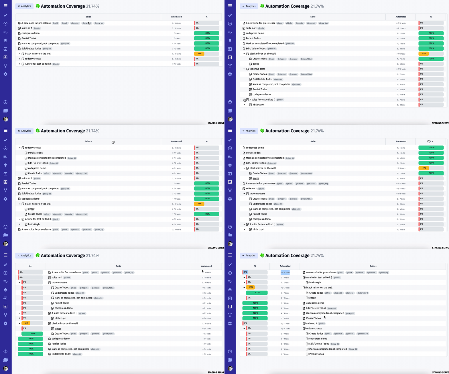
As a management system for automated tests, Testomat.io team created an Automation Coverage Board where you can track the progress of automation coverage on the project. You can sort your tests by Suite and Automation indicators.
Custom Charts
Custom charts are a powerful addition to analytics. They allow you to customise the display of data that is important to you.
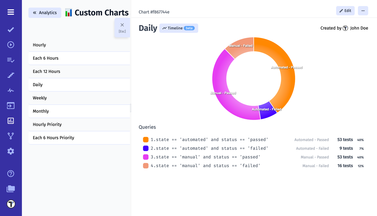
How To Customise The Chart View?
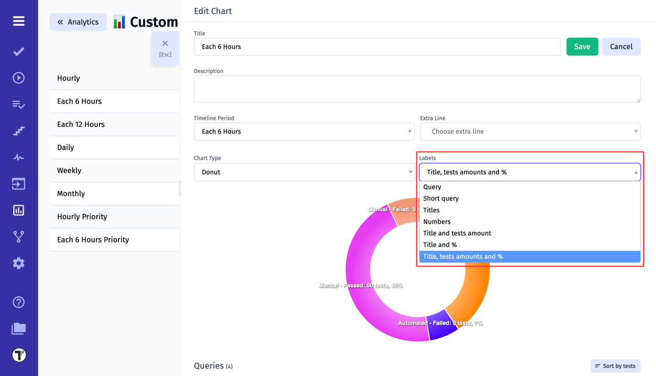
In the Edit mode, select the Labels field to customise the information on the chart to your preference:
| Label | View |
|---|---|
| Query | state == 'manual' and status == 'failed': 9 tests |
| Titles | state == 'manual' and status ...: 9 tests |
| Short query | Manual - Failed |
| Numbers | 9 |
| Title and tests amount | Manual - Failed: 9 tests |
| Title and % | Manual - Failed: 7% |
| Title, tests amounts and % | Manual - Failed: 9 tests, 7% |
Timelines
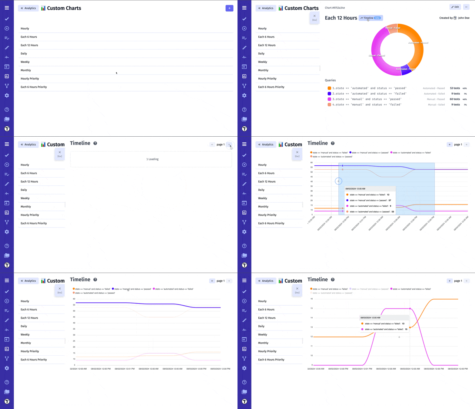
Timelines for Custom Charts, a feature that allows you to visualize data trends over a specified period. A timeline is a graphical representation of events or data points in chronological order. It helps in understanding trends, patterns, and changes over time by displaying information in a linear format.
- Search Query-Based Timelines: When creating custom charts, you can now set up a timeline period based on your test search queries.
- Data Collection: Testomat will collect data for the specified test search queries over the selected period.
- Timeline Chart View: The collected data is displayed in a timeline chart view, providing a clear visual representation of how your test metrics evolve over time.
This feature enhances your ability to track progress, identify trends, and make informed decisions based on historical test data.
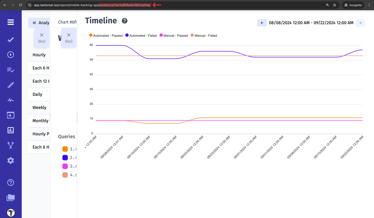
Each timeline is associated with a unique URL, which can be copied and shared with other members of the project team.
Failures Board
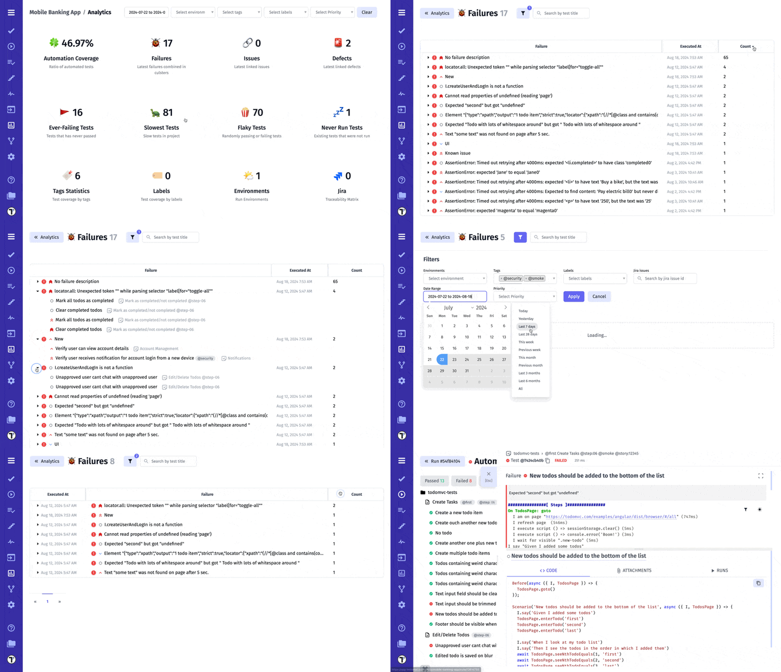
Your team may require visualizing your current status on the project. This is implemented with Failures Board. There you can see failures from the latest test runs, navigate to the suite, latest test run, and the failed test itself. For the Failures widget, we added the ability to group and sort failures found on the project.
Issues Board
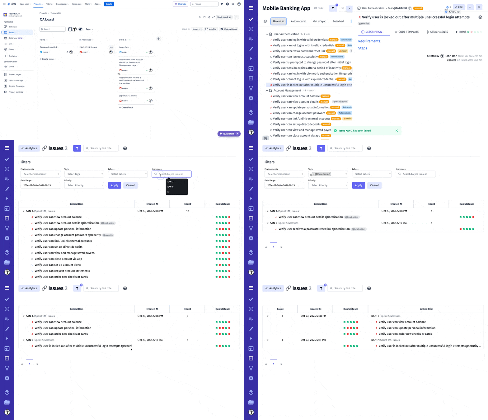
The Issue Board provides a comprehensive view of all tests, suites and runs associated with an issue. It displays a list of associated test cases and test suites, ensuring visibility of relevant automated or manual tests. This feature helps maintain traceability between issues and tests, making it easier to monitor coverage.
Visit the Issues Management Systems page to find out which systems Testomat.io supports and how to connect.
Flaky Tests
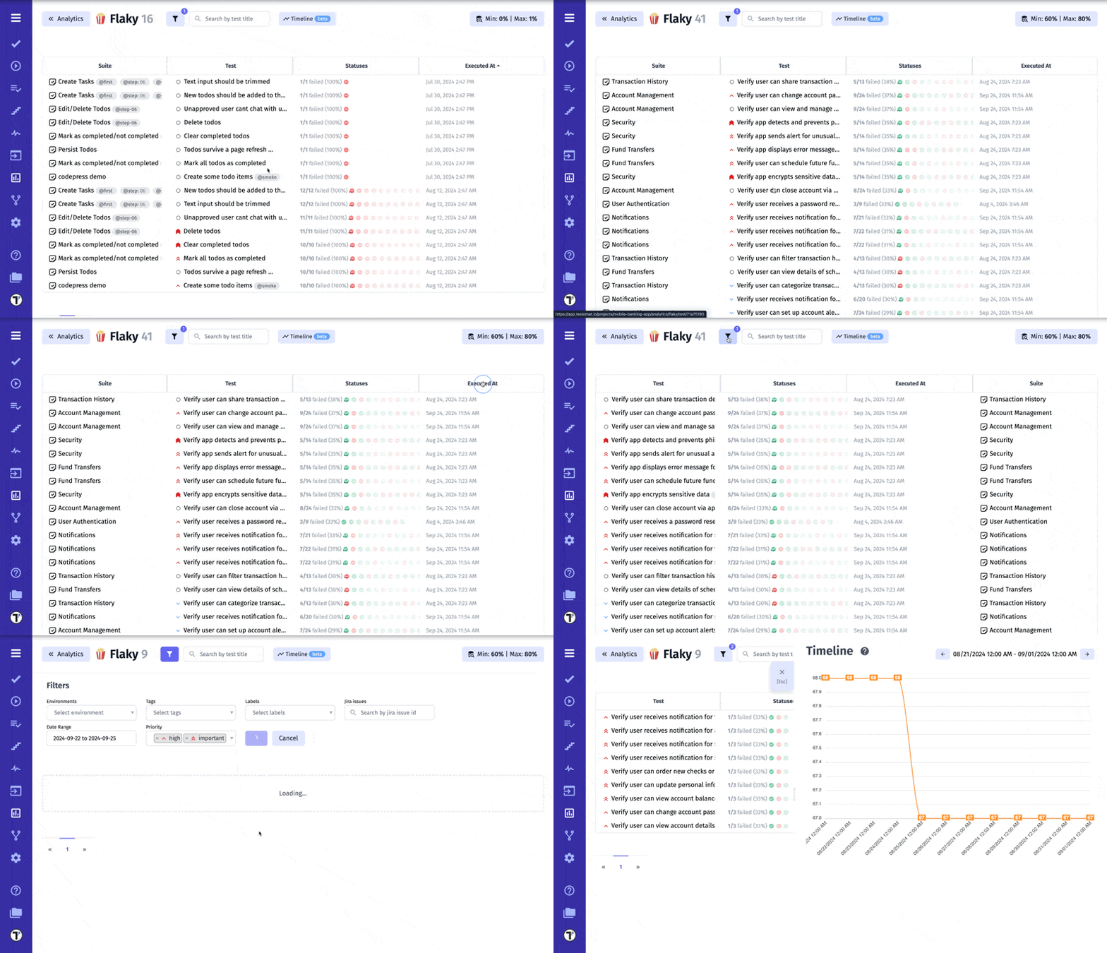
There may be some unstable automated tests on your project that sometimes fail and sometimes pass.
How does it work?
Flakiness is determined by calculating the average value of run statuses for a given test. The method of calculation can be defined based on specific parameters, including a minimum and maximum success rate threshold.
- Minimum Success Rate: Defines the lowest acceptable pass rate to be considered within the flakiness range.
- Maximum Success Rate: Defines the highest acceptable pass rate to be considered within the flakiness range.
Analytics will identify and display tests that have a pass rate falling within the defined range. The pass rate is calculated based on the last 100 runs.
Example:
- Minimum Success Rate: 40%
- Maximum Success Rate: 60%
If a test has been run 14 times and succeeded 7 times, the success rate is calculated as 50%. Since 50% falls within the defined range (40% to 60%), this test would be considered flaky and displayed in the analytics report.
Slowest Tests
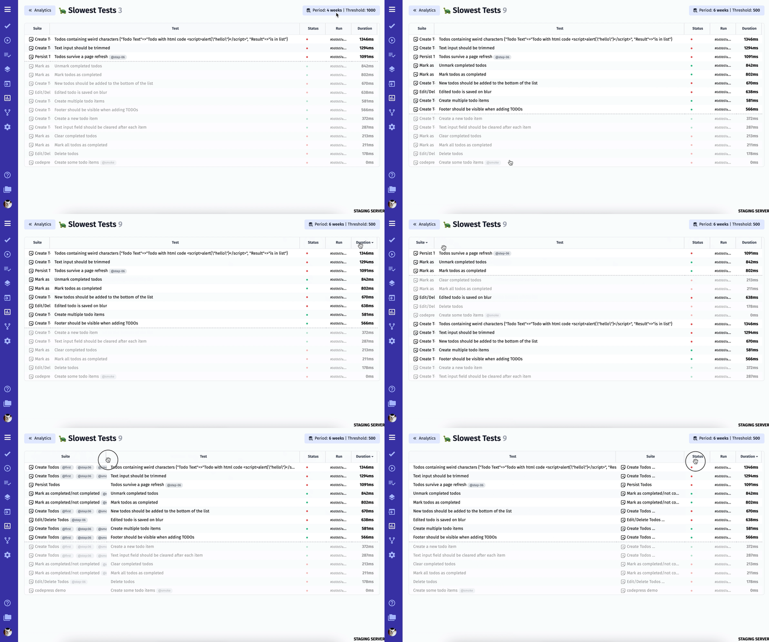
It is well known that automated tests need maintenance and refactoring. The Slowest Tests widget will help you to define such automated tests and help to visualize them. You can sort them by execution duration and passed/failed status to prioritize your work effectively.
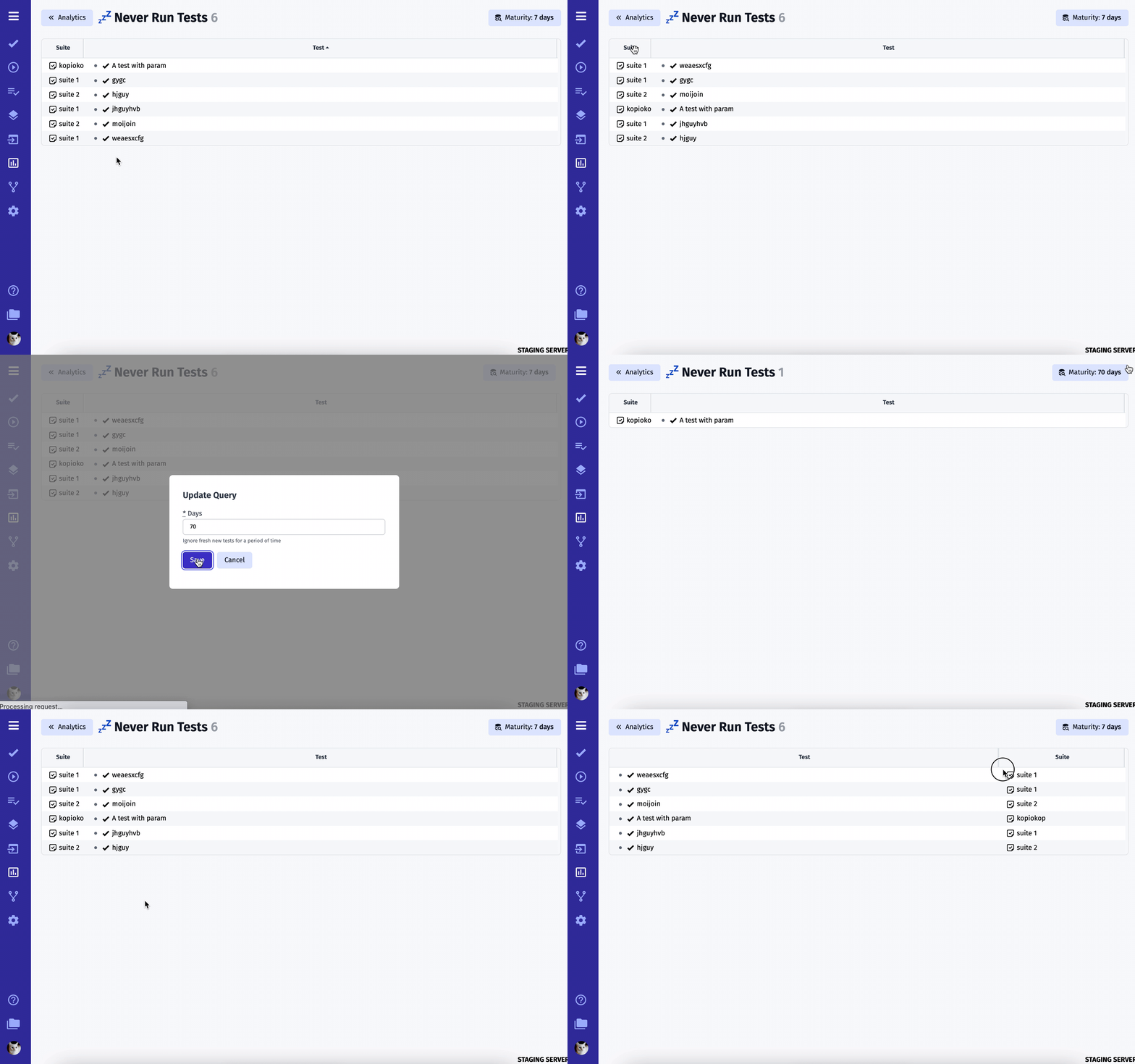
Never Run Tests
There may be tests that were never executed on your project because they simply got lost or forgotten. To avoid such situations we added Never Run Tests that will show you test those ones.
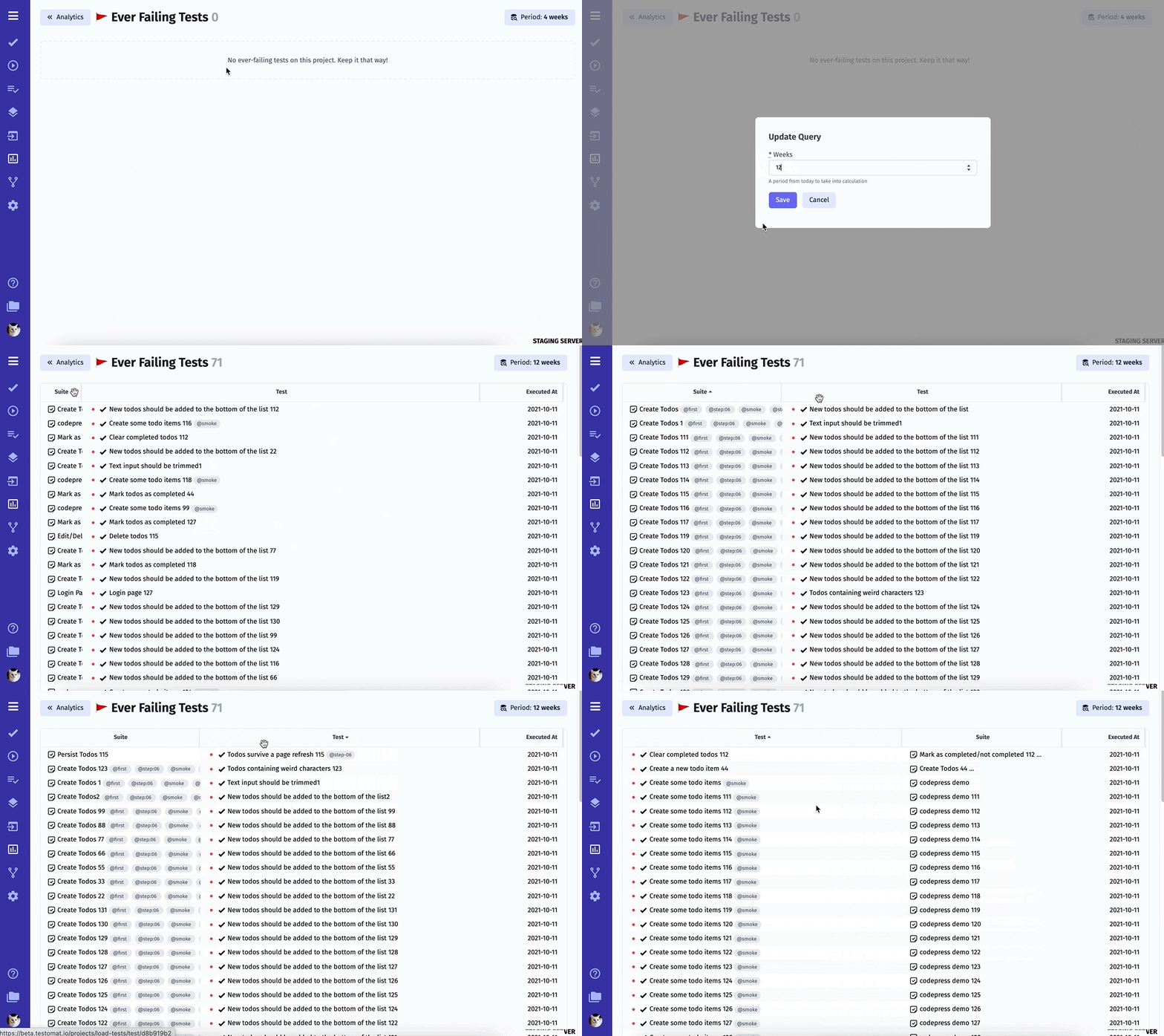
Ever Failing Tests
Ever Failing Tests is another useful Analytics widget that will show you automated tests that never passed. This feature will help you to pay attention to potential risks in your application.
Labels Statistics
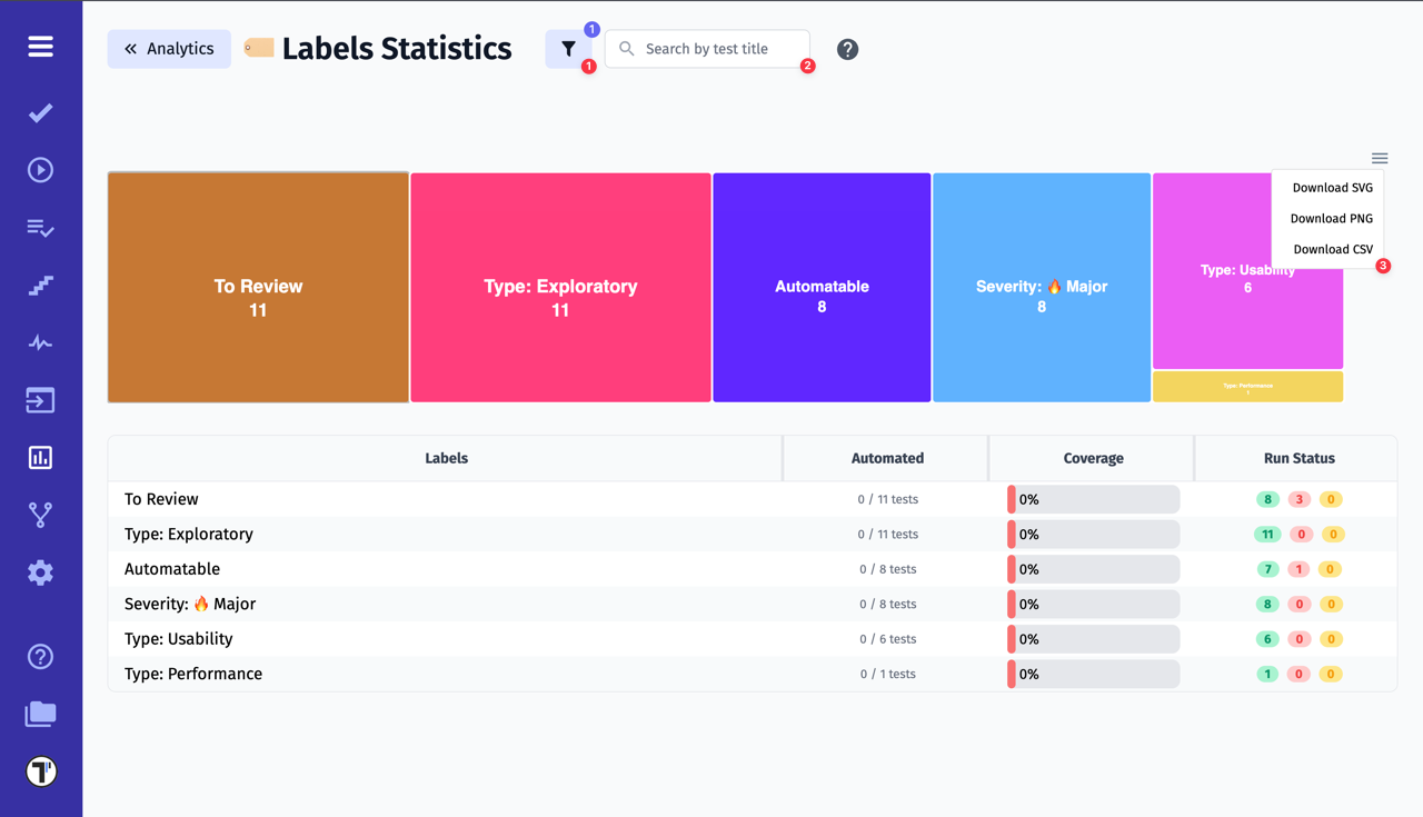
Labels Statistics is a feature that allows users to visualize test coverage by labels on an interactive chart. It provides an efficient way to analyze and track the status of testing with the following capabilities:
-
Label coverage visualization: you can view information about which tests need to be reviewed, which can be automated, and what impact they have on the system. You can set up your own labels or use the ready-made ones offered by Testomat.io. To learn how to add labels to the project, visit a dedicated page.
-
Test filtering (1) and search (2): for convenience, there is filtering by Environments, Tags, Labels, Jira issues, Date Range, Priority, as well as search options to quickly find tests by name or other criteria, making it easier to locate specific tests.
-
Chart download (3): the feature allows to export the chart in multiple formats such as PNG, SVG, or CSV, facilitating further analysis or sharing with team members.
-
Automation coverage analysis: you can evaluate the level of test automation, helping to identify which parts of the testing process are already automated and where additional efforts are needed.
This tool enables teams to manage the testing process more efficiently, quickly identify issues, and optimize automation efforts.
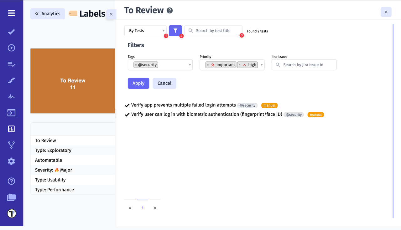
Another big plus is the detailed statistics for a particular label. Click on the label to open another window with options.
You will see all tests with this label. You can also filter (2) by Tags, Priority and Jira Issues or search (3) for specific tests.
Additionally, there is a special option (1) to display tests:
- By Tests - shows all tests created in the project with this label.
- By Runs - only shows tests that have a run result.
Analytics In Run Reports
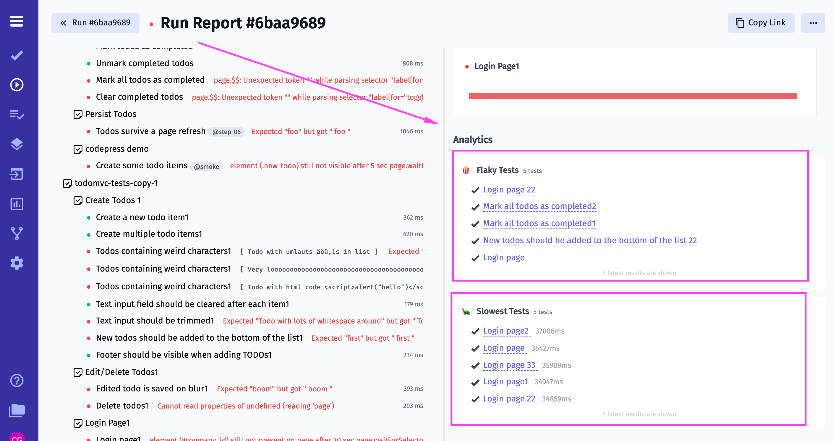
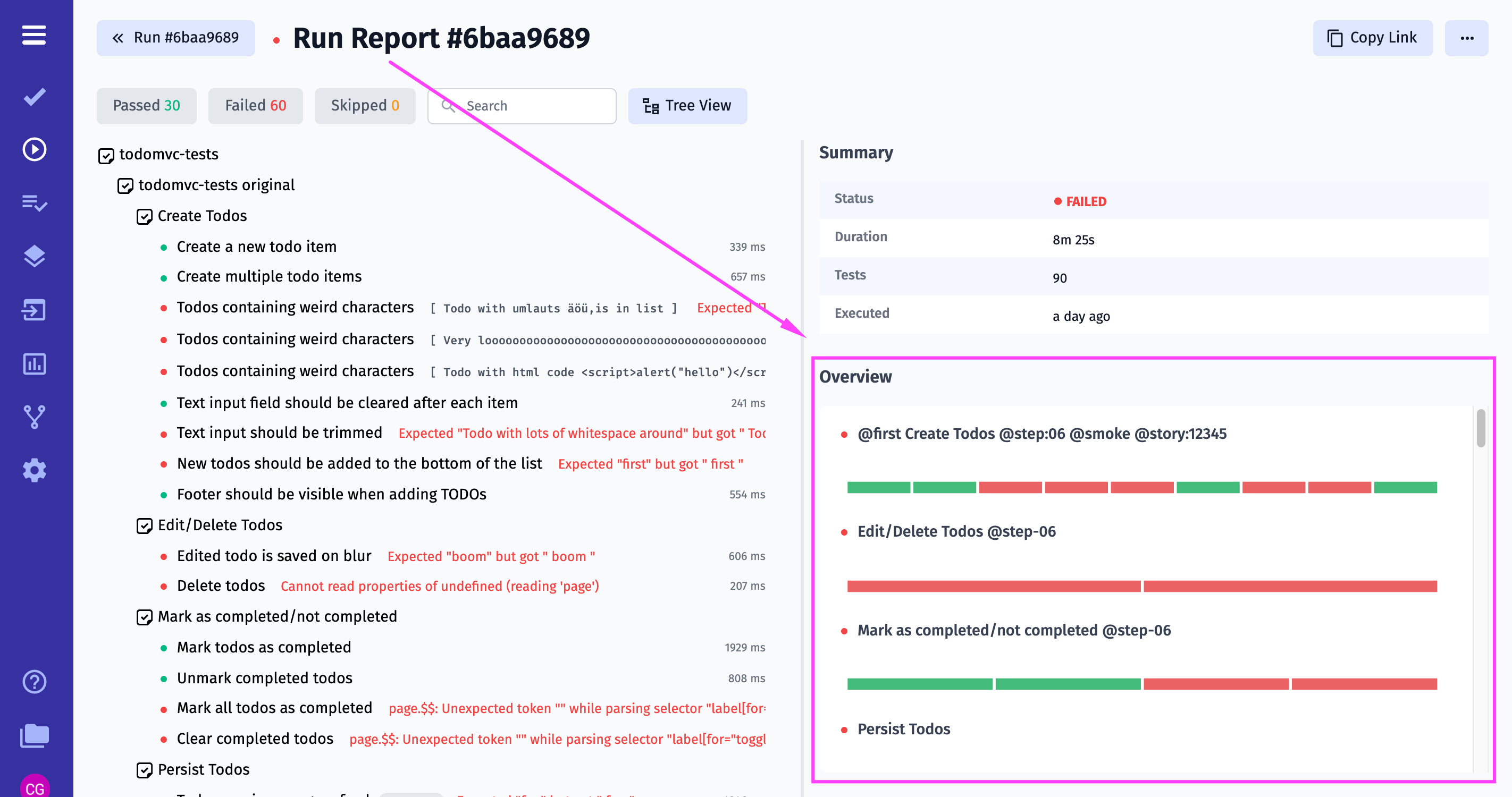
We empowered Testomat.io Run Reports with Overview chart, Flaky and Slowests tests widgets, so you receive more essential information in one place at one time.
Overview chart visualizes aggregated tests statuses by suites:
Flaky and Slowests tests widgets show the latest 5 tests and navigate to dedicated Analytics pages:
